
Unleashing Your Inner Creativity: Creative ideas for chart making
Are you tired of creating lackluster charts that fail to engage your audience? Look no further! Our guide offers creative ideas and tricks for making visually appealing chart that will leave a lasting impression.
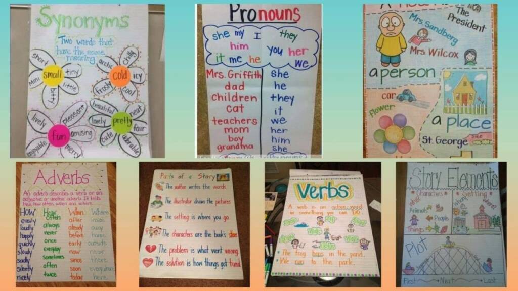
15 Creative ideas for chart making
Hello friends! In today’s article, we will talk about 15 new and creative ideas for making charts. Before creating a chart, you must know what information you want to present and what audience it is for. So let’s get started!
- Doodle Chart: Create your chart by doodling it and use colors that make your chart visually appealing.
- Infographic Charts: In infographic charts, you can present your information visually by combining text and graphics.
- Flip Chart: Flip charts use multiple pages together that you can cover multiple aspects of a topic.
- Mind Maps: Mind maps present information in a diagrammatic structure that will make it easier for your audience to understand the structure of the information.
Tips for Crafting Eye-Catching Charts
- Venn Diagrams: Venn diagrams compare multiple categories and highlight overlaps.
- Pie charts: Pie charts show information in percentages that will be easier for your audience to understand visually.
- Bar Graph: In bar graph, information is presented through bars and you can present multiple categories together.
- Flow Chart: A flow chart presents a process step-by-step in a way that is easy for your audience to understand.
- Gantt chart: A Gantt chart presents a project through a timeline, making it easier for your audience to understand project progress.
- Organizational Charts: In organizational charts, the structure of an organization is presented diagrammatically.
Also Read: Unique and Creative 15 Paper Diwali Decoration Ideas
Creative ideas for chart making
- Word Clouds: In word clouds, words related to a topic are presented in a cloud that will make it easier for your audience to grasp the gist of the information.
- Timeline Chart: In a timeline chart, an event or process is presented through a timeline.
- Scatter Plots: Scatter plots present data related to a topic using dots to make it easier for your audience to understand the relationship between the data.
- Comparison charts: Comparison charts show comparisons across multiple categories to give your audience an idea of the comparison.
- Bubble Chart: In a bubble chart, data related to a topic is presented through bubbles that will make it easier for your audience to understand the magnitude of the data.
Install our app for more news and daily updates: @tfiglobal